Four Cognitive Principles That Can Make Innovation Surprisingly Obvious
 No matter how cool or useful our innovation is, it is very difficult to get people to try it if they don’t understand it. People are cognitive misers, and generally don’t like things they have to think a lot about.  If we have to explain what an innovation is, we are asking people to invest their cognitive resources without a guarantee of reward, and so risk them not engaging.  Explanation also risks losing, or at least diluting the “Wow” moment of discovery (unless we design it into our explanation, which is the topic for another blog).  But if they intuitively ‘get it’, and even better, ‘why it is better than what they have at the moment, we have eliminated one of the biggest barriers to trial that innovators face.
Build It and They Will Come? However, innovation almost by definition must also feel new and exciting. We therefore typically face a bit of a trade off, needing to be both new and familiar at the same time. So in this blog I’ll share some well established insights from psychology that we can often use to help us solve this dilemma, and hence be both surprising and obvious at the same time.
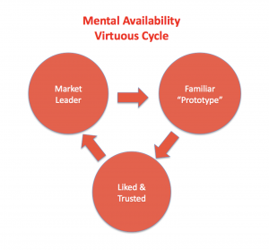
1. Leverage the Prototype: Prototype Theory tells us that every category has a prototype, and that these are quickly and automatically recognized and understood. For example, when we say bird, an exemplar that looks like a robin, or maybe a sparrow is more likely to pop into our mind than a penguin. With a car, it is probably something that looks a bit like a Toyota Camry.  This mental availability often drives a virtuous circle that  results in a few very well known members of a category owning large market shares – as in the case of the aforementioned Camry.   Popular products and brands are familiar, we like familiar things (the Mere Exposure Effect from Cognitive Psychology), and we buy things we like.

This virtuous cycle mirrors part of the Ehringberg Bass marketing laws of polygamous loyalty, which I won’t discuss further here, except to say that as innovators, we are often charged with breaking into this cycle.  Maybe we want to “out Camry” the Camry, and replace the market leader, or perhaps we want to create a new, alternative market that draws business away from the existing prototype.  But it is extremely difficult to do this if people don’t understand our innovation.  As mentioned earlier, people are cognitive misers, and in general don’t like thinking.  So the more work we ask of them to understand our innovation, the more difficult it is to generate trial.  Of course, if we have an enormous, world changing benefit, we may just need to get it into the hands of a few early adopters, and they may do the rest for us, via word of mouth and advocacy.  But in reality, very few innovations are really that breathtaking, while as an innovator, it is all too easy to fall into the trap of ‘new’ at the expense of understandable, or to be so close to our innovation that we think it is bigger and more intuitive than it really is.  And even if we have passionate advocates, we make it easier for them to spread the word if our innovation is at least reasonably intuitive.
If we want our  innovation to be intuitive, one of the easiest ways is to leverage Prototype Theory.  If we know the prototype for our category, we can design in enough cues that reference it so that people know what it is without our having to explain it. This doesn’t mean that we have to look like the prototype exactly, far from it. We can always add stuff to differentiate from it, or evolve it.  But having the right cues in place means people work out what it is for themselves. So whether we are designing an innovative electric or self driving car, a restaurant, or a retail environment, one way to increase our chances of breaking into this cycle is to include cues that match the category archetype, even if they are not a technical necessity. If it has enough cues that people ‘get it’ intuitively, it will increase trial, save marketing dollars, and probably reduce anxiety about new technology where appropriate.  For example, a driverless car may not technically need a drivers seat, front windscreen, wipers, or a host of cues associated with what we think of as a typical car.  But we should at least be thoughtful about removing them.
2. Peak Shift. It’s more than OK to design an eagle rather than a sparrow, and Peak Shift is a concept from psychology that can help us do this. Instead of differentiating via addition, we can take one or two core attributes from a prototype and exaggerate them. This is somewhat analogous to caricature, where for example, people will recognize a cartoon of Jay Leno with an enormous chin faster than a realistic photo of him. So with a car, we can make the wheels bigger, the hood longer, or the shape more streamlined. In this way we can advance the prototype.  Our eagle may be a Ferrari or Corvette, instantly recognized as an exaggerated car, super car, or car+. Building peak shift into the design can be used in this way to  automatically signal a premium entry into a category.  Or it can also signal specific point of differentiation, and perhaps the creation of a new subcategory, as in an SUV, by exaggerating specific cues that are associated with secondary function.  The beauty of Peak Shift strategies is that they tap into fundamental ways people process information, and so can be broadly applied to automotive, fashion, electronics or pretty much any consumer goods I can think of.
3. Trigger Analogy. Knowledge Representation, taken from Cognitive Psychology, tells us that humans try to understand something new by using analogy to tie it back to something they already know. People do this automatically, but we can help the process run more smoothly if we leverage design and communication to steer people towards the most useful analogy. Analogy can be functional, as in the swipe function on the first IPad which mirrored how we turned the page on a book, or conceptual, as in designing a retail process on a website that mirrors a more familiar bricks and mortar equivalent. Activate the right analogy, and people just ‘get it’. But triggering the wrong analogy can cause all sorts of problems. If anyone remembers it, which is always a challenge when looking for case studies of failed innovation, Febreze ‘Scent Stories’ is a case in point. Meant to be a scent product, it drew so many analogies to a CD player that Febrze needed a FAQ to explain it didn’t play music.
4. Conceptual Blending. Some inventions are too breakthrough to have a prototype, or a simple 1:1 analogy they can be mapped onto. As an innovator, this is a really cool space to be working in, but it does pose the ‘what is it’ barrier to trial. Conceptual blending is one option to manage this. For example, if I describe something as the “Rolls Royce†of jeans, an ‘off-road’ shoe, or even “Underarmourâ€, most people will automatically blend these concepts, and fluently understand what they are without a need for detailed explanation. We are tapping into their existing knowledge, but framing it in ways that most people cannot avoid understanding what the new idea is.  This is incidentally, also a great way to drive innovation (what does an ‘off-road’ camera or computer look like, or the Rolls Royce of home appliances). Of course, we need to find the right blends - ones that combine to tell our story, but that also align sufficiently to blend in a way that makes intuitive sense to potential customers.  But this can be much more effective than trying to explain something new from scratch.
Authenticity. One thing that all of these approaches share is that they leverage what people already know, albeit in new ways. This is powerful,, because we trust ourselves more than virtually any other source of information. Teenagers usually have to learn from their own mistakes, despite the best efforts of parents to educate them from their own experience, in part because they trust first hand information more than second hand information.  Likewise, even the most well designed and expensive advertising campaign can struggle with authenticity if it is perceived as having a vested interest. Having an established, trusted brand obviously helps with this, and we can employ all sorts of social proof strategies such as celebrity endorsement or independent user rating to add authenticity.  But it’s hard to beat the authenticity that comes with a shopper working out for themselves what a new innovation does, and how much they need it.
Adapted from a previous post at LinkedIn
Wait! Before you go…
Choose how you want the latest innovation content delivered to you:
- Daily — RSS Feed — Email — Twitter — Facebook — Linkedin Today
- Weekly — Email Newsletter — Free Magazine — Linkedin Group
 A twenty-five year Procter & Gamble veteran, Pete Foley has spent the last 8+ years applying insights from psychology and behavioral science to innovation, product design, and brand communication. He spent 17 years as a serial innovator, creating novel products, perfume delivery systems, cleaning technologies, devices and many other consumer-centric innovations, resulting in well over 100 granted or published patents. Follow him @foley_pete
NEVER MISS ANOTHER NEWSLETTER!
LATEST BLOGS
How To Stay Connected to Your Co-Workers as a Digital Nomad
The digital nomad lifestyle has grown dramatically in recent years. The number of digital nomads has increased by 42%…
Read MoreCarbon neutrality: what is it, how to achieve it and why you should care
When sustainability is on the agenda, you’re likely to hear many terms mentioned that you may or may not be…
Read More


